COVER-

The general layout of the two covers is quite different, as
although some aspects such as the barcode in the bottom left corner and the
masthead at the top with the tagline underneath most of the other things do not
resemble each other. My music magazine has few coverlines, whereas my college
magazine has many. My music magazine appears to be much more professional
because of this, and so you can see that I have made progress when it comes to layout.
The colours used on my college magazine cover are all quite
bright, as this was suitable for the purpose. Contrariwise the colours used on
my music magazine are dark, as this is fitted to the rock genre, meaning it
will engage the target audience.
The fonts and font sizes used on my college magazine cover
are very simplistic- the only aspect that is different is the masthead, which
is simply in a bolder font. This is not very affective as it is not very
engaging and is quite ‘boring.’ However, on my music magazine cover I rectified
this, as I have used different fonts and different font sized to make the cover
much more engaging and so this would make the magazine sell.
The main image on my college magazine cover is not very
good. It has been cut badly, and the image appears to have been taken in a rush
(which it was) and has no real gesture to it or appropriate emotion.
The main
image on my music magazine is much better as it is very clear and the gesture
and emotion fits in with the genre. As well as this, you can see that my
PhotoShop skills have developed, as I have cut this image out better in order
to make my models face stand out.
CONTENTS PAGE-
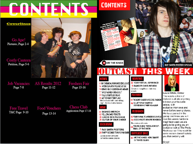
The colours used on my college magazine contents page are
very ‘girly’ and quite pop-like. The colours are very bright, and so this gives
the impression that the magazine is about positive things. For my music magazine
contents page I took this into consideration, as I had to ensure that the
colours were not as bright, as this would not be suited to the rock genre.
My music magazine has very clearly set out columns, as you
can see the sections in which the different text belongs- this is a major
improvement from my college magazine, as on this I have not set the columns
out, and have just put them into a straight line. This is not very engaging and
does not look affective.
The main image used on my music magazine is fit for purpose-
it suites the rock genre and so goes with my magazine well. It has had a lot of
thought put into it and is clear; the background is also good as it is not
boring. This is completely different to the unclear picture on my college
magazine, which was taken in a rush with poses and the background not taken
into consideration.
The fonts used on my college magazine are again, very simple and uninteresting. This was relevant for a college magazine as they are never 'dramatic' nor do they stand out much. I thought about this when creating my music magazines contents page, as here it was important that I used fonts and font sizes that stood out, and therefore suited the rock genre.
SUMMARY-
My skills have developed a lot over the course of producing my music magazine. It is clear to see that I have made a lot of progress and now have a greater understanding on how to use different technologies, as well as being able to distinguish between different genres- as the genre is key for all the important aspects of a magazine such as fonts, images and colours.
iShowU-
No comments:
Post a Comment