Wednesday, 27 March 2013
Dear Moderator,
Welcome to my media blog... I hope you enjoy looking through my posts and like the rock magazine I have created.
My Research and Planning begins on 5th September 2012.
The Start of my Evaluation posts start on 10th March 2013.
You will find my completed music magazine below.
Thanks,
Emma Hibbert
:).
Thursday, 14 March 2013
QUESTION SEVEN: Looking Back On Your Preliminary Task, What Do You Feel You Have Learnt In The Progression From It To The Full Product?
COVER-

The general layout of the two covers is quite different, as
although some aspects such as the barcode in the bottom left corner and the
masthead at the top with the tagline underneath most of the other things do not
resemble each other. My music magazine has few coverlines, whereas my college
magazine has many. My music magazine appears to be much more professional
because of this, and so you can see that I have made progress when it comes to layout.
The colours used on my college magazine cover are all quite
bright, as this was suitable for the purpose. Contrariwise the colours used on
my music magazine are dark, as this is fitted to the rock genre, meaning it
will engage the target audience.
The fonts and font sizes used on my college magazine cover
are very simplistic- the only aspect that is different is the masthead, which
is simply in a bolder font. This is not very affective as it is not very
engaging and is quite ‘boring.’ However, on my music magazine cover I rectified
this, as I have used different fonts and different font sized to make the cover
much more engaging and so this would make the magazine sell.
The main image on my college magazine cover is not very
good. It has been cut badly, and the image appears to have been taken in a rush
(which it was) and has no real gesture to it or appropriate emotion.
The main
image on my music magazine is much better as it is very clear and the gesture
and emotion fits in with the genre. As well as this, you can see that my
PhotoShop skills have developed, as I have cut this image out better in order
to make my models face stand out.
CONTENTS PAGE-
The colours used on my college magazine contents page are
very ‘girly’ and quite pop-like. The colours are very bright, and so this gives
the impression that the magazine is about positive things. For my music magazine
contents page I took this into consideration, as I had to ensure that the
colours were not as bright, as this would not be suited to the rock genre.
My music magazine has very clearly set out columns, as you
can see the sections in which the different text belongs- this is a major
improvement from my college magazine, as on this I have not set the columns
out, and have just put them into a straight line. This is not very engaging and
does not look affective.
The main image used on my music magazine is fit for purpose-
it suites the rock genre and so goes with my magazine well. It has had a lot of
thought put into it and is clear; the background is also good as it is not
boring. This is completely different to the unclear picture on my college
magazine, which was taken in a rush with poses and the background not taken
into consideration.
The fonts used on my college magazine are again, very simple and uninteresting. This was relevant for a college magazine as they are never 'dramatic' nor do they stand out much. I thought about this when creating my music magazines contents page, as here it was important that I used fonts and font sizes that stood out, and therefore suited the rock genre.
SUMMARY-
My skills have developed a lot over the course of producing my music magazine. It is clear to see that I have made a lot of progress and now have a greater understanding on how to use different technologies, as well as being able to distinguish between different genres- as the genre is key for all the important aspects of a magazine such as fonts, images and colours.
iShowU-
Wednesday, 13 March 2013
QUESTION SIX: What Have You Learnt About Technologies From The Process Of Constructing This Product

I have used Blogger to show my progress. Every piece of work I have completed I have uploaded onto Blogger, so that I can see the process of my magazine being completed through research and planning and finally the actual creation of it.

I used a Canon 450D SLR camera to take the test shots and pictures for my magazine.


I used iPhoto and Image Capture to import the pictures I took.

I used PhotoShop to create my magazine.


I used FaceBook, Tumblr and Twitter to get feedback from my target audience on my magazine.

I used InDesign to create my contents page on my college magazine- I found this challenging and so used photoshop to create my entire music magazine.

I used Flickr to annotate my magazine throughout the evaluation process.

I used Prezi throughout my research and planning as well as on my evaluation to clearly present my magazine.

I used iShowU throughout my research and planning and evaluation to show my progress and the process of creating my magazine.
iShowU-
QUESTION FOUR- Who Would Be The Audience For Your Magazine & Why?

Above is a picture of what I believe a member of my target audience would look like. I believe that those who would read my magazine would be into their music, and so would wear band t-shirts, but do not care much about their appearance and so would dress quite 'simply' in clothing such as skinny jeans and converse. My target audience would listen to soft rock/punk bands such as You Me At Six, Panic! At The Disco and My Chemical Romance. I believe this as these are the types of bands that would be featured in my magazine.
They would purchase their clothing from somewhere like pulp, and would wear brands such as David And Goliath. My target audience would have a very simple sense of humor and so would watch shows such as Mythbusters. My target audience would more play games and spend time on the internet than watch shows, and so would watch youtubers such as PewDiePie for entertainment. They would buy my magazine because the humor inside would be fitted with their interests as well as the bands inside being the bands that are liked by them. They would buy it because they aren't that many rock magazines like Kerrang, and so they would purchase it to find things out about their artists that they could not do so otherwise.


QUESTION TWO - How Does Your Media Product Represent Particular Social Groups

Posture/Gesture: The posture used in the two images is quite different. My image shows the artist being very 'open' as if they are going to tell the reader something (which is what my double page spread focuses on) where as the image from Kerrang shows the artist as closed, as if they are slightly insecure and hiding something from the reader.
Angle: Both of the images are at a point of view level. The two images are looking directly at the model, as this makes you focus more on the facial expressions being used. Both of the images appear to have a very direct connection with the reader.
Shot Type: Both images use a medium close up shot. This shot allows the reader to see what is being worn, as well as feel as if they are on the same 'level' as the artist, as the shot is quite intimate.
Lighting: I have used natural lighting for my image, as this gave the image a more 'monotone' feel. The natural lighting makes the image appear to be more realistic and less posed, and seen as though my double page spread is all about the artist opening up, this seemed to be more appropriate. The lighting used in Kerrang however is studio lighting, which makes the artist appear to be more pale- this makes the audience see that this is how Gerard likes to appear, and so they will connect with this and strive to appear similar.
Costume/Hair: The medium close up shot allows the reader to see the 'rock' like mise-en-scene. By doing this you can see the red shirt my model is wearing (that goes with my cover and double page spread) and you can see the grey shirt and black jacket on the image from Kerrang. This allows readers to connect more as they can see what there favourite artists like to wear, and how they present themselves. My model has hair covering his face slightly, which makes him appear to be more insecure, as it is as if he is hiding in a way- but by doing so, this fits in with the rock genre, as it is stereotypical for those in rock magazines to have long, uncared for hair. Differently the image from Kerrang shows their model with his hair scraped back- this shows his facial expressions more and shows us that he is not afraid of 'anything' and this is suited to the rock genre as it seems he is an intimidating person.
Expression:Both of the images have a very monotone feel about them. Both my model and Gerard Way have very little expression at all- they are both very stern looking because of the lack in emotion. This shows us that perhaps something negative has happened, or that this is the way the rock genre is to be presented.
Conclusion-
My magazine has a very 'mature' rock feel to it. The target audience is therefore those who are older teens/young adults. The magazine is likely to contain bad language, and so would be more suited to those who are over 16. The dark colours used are more likely to draw in the attention of males, however some females may also find this appealing, as the main image is of an 'attractive' male. Gerard Way (on Kerrang) is seen to be looking directly into the camera which makes him appear to be aggressive and unapproachable- this represents the genre as one that is dark and 'negative.' The article in Kerrang is one about the band My Chemical Romance, and so Gerard is seen to be very casual and unposed, however as my article is a tell all about one artist I have made my model still appear to be rockish by holding their eye-line at the camera but is stood with their arms open to represent that all is being said. And so, (mostly male) young adults are represented here, as they are likely to be drawn in to what the magazine contains.
Sunday, 10 March 2013
QUESTION ONE- In what ways does your magazine use, develop, or challenge forms and conventions of real media products?
USE, DEVELOP, CHALLENGE

Layout-
USE: I
have used the same general layout as a typical kerrang cover. Kerrang covers
have a ‘big’ image in the centre, which covers the masthead slightly- they have
a small barcode and text on the header and footer of the page. I have done so by placing my image in the
centre also, with my cover lines kept in a single column down one side.
DEVELOP: On
kerrang and other rock magazines for a poster special the images are usually
lined up in a rectangular box- however I have changed this slightly. I have put
the ‘poster’ images in a square box and overlapped them slightly, as this still
has a ‘feel’ of Kerrang but is however slightly different.
CHALLENGE:
Kerrang keeps all cover lines to one side. I have put one of my cover lines on
the right, and put it in a black box so that it stands out. All of Kerrangs cover
lines are kept ‘together’ and are very simple, and so me doing this is
something very different and unusual- however it still fits in with the genre
well.
Colour-
USE: I
have used a similar colour scheme to Kerrang- Kerrang uses predominantly red
and yellow, and so I have also used these colours.
DEVELOP:
I have stuck to the three colour rule by using yellow and red like Kerrang but
I have also used more black than Kerrang as I believe this fits to the genre
and makes things stand out more.
Images-
USE: The
main image on Kerrang is very close up, so that the facial expressions can be
seen with ease, so I also shot my image in a way facial expressions can be seen
clearly.
DEVELOP/CHALLENGE: Kerrang used a close up, where
as I used a medium close up shot- by doing so you can see the mise–en–scène but the ‘closeness’ remains the
same on both covers. The person used on my main image is wearing a red shirt,
and this fits in with the colours used, and so I thought that this being seen
was important.
Story-
USE:
Kerrang puts the artists name central, so that we see this is the main point- I
have also done this so that this is what people are drew to and know who the
story is actually about.
DEVELOP:
Under the artists name Kerrang uses a quote from the double page spread,
however I have used a more ‘broad’ statement “Answers All” as this still
suggests that the interview will reveal a lot and makes you want to read more
but does not give too much away.
CHALLENGE:
Kerrang uses text above the artists name to draw readers in. In the issue I
used mostly for inspiration Kerrang uses “the people vs” then the artists name,
by doing so this creates more of a sincere and interesting vibe. I have however
not put anything above the artists name, I have left this blank and straight to
the point, so that readers will be engaged and want to know what the double
page spread is actually about.
Fonts and Font sizes-
USED: The cover lines on Kerrang are written in a very
simplistic font, and so I did this with mine also- I used a small font that
still stands out in order to get this affect.
DEVELOP: For the main story Kerrang has used a simple,
regular font that is a large size, I however used a large font that is in a ‘bubble’
kind of effect, and is very bold- this still shows the artists name in a
similar way, however presents it a little differently.
CHALLENGE: The masthead on Kerrang is very spaced-out and
large, it seems to be ‘damaged’ as it has marks through the text. On my cover I
have changed this, as I have used a simpler font, where the text is all
together, and very bold. This still fits in with the genre of rock, but does
not look the same as Kerrang.


-->

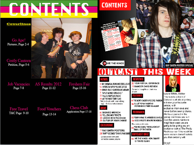
Layout-
USE: Kerrang
uses a big image to the right at the top of the contents page, with an example
of what is going to be in the magazine to the left. The text comes under this
as a ‘separate’ section. I have used the same layout as this, as I have put my
main image to the right, a ScreenGrab of my double page spread to the left and
my contents underneath.
DEVELOP: Where
Kerrang would usually use one ScreenGrab to the left, I have changed the layout
slightly by putting only one- this meant that the layout had to be altered so
that it didn’t look too plain. Kerrang has a small ‘tab’ which shows something
the magazine contains to the right, I altered this by placing mine to the
right.
CHALLENGE: Kerrang
has a column to the lower left side of the page that shows something written by
the editor of the magazine, I however have done this to the right, so this
means my columns have a slightly different layout to Kerrang.
Images-
USE: The main
image on Kerrang is usually a close up shot, and so you can see the person very
clearly- I used this general idea by using a shot type that shows the persons facial
expressions.
DEVELOP:I used a
medium close up shot instead of a close up, so that you could see the prop I
had used. This is slightly different to Kerrang as this is not how artists are usually
presented.
CHALLENGE: The only mise-en-scène Kerrang
uses is the costume the artist wears, and so I decided to add in a prop of a
guitar, and so this makes the two contents pages differ.
Colour-
USE: Kerrang
uses Red, black and yellow, and so I used the black and red as I believe these
are the two colours that stick out more.
DEVELOP: Instead
of using a lot of yellow, I used dark backgrounds and used white text, as this
goes with my cover more, meaning the two are therefore more similar.
CHALLENGE:By
changing to two colours (and white) this is very different to Kerrang, as
Kerrang usually sticks to the three colour rule.
Story-
USE: Kerrang
shows what the page is about briefly, and then under some develops this
further, and so, I have also done this to show the reader more on what the
article is about.
DEVELOP: Kerrang uses more images than I
did, and so, I included more text to fill the blank space. I did however keep
this worded and presented in a way Kerrang would, and so it is not completely
different.
CHALLENGE: Kerrang uses nine headings to show
the different columns- I have however used fewer, and so the stories differ
slightly.
Font/Font sizes-
USE: Kerrang
uses the same large text to show the words “contents” to the top and “this week” in the middle. I
used this as I ensured that I used the same font for both of these things on my
contents page also, as this makes it appear to be very Kerrang like.
DEVELOP: Kerrang
uses a bold font to show the stories so that they stand out. Instead of using
bold I used a larger text in arial, as this still made the stories stand out
but was not identical to the font in Kerrang.
CHALLENGE: Kerrang used a very simple font
to show the “contents” and “this week” text. I used the font 28days later,
meaning the font is very unique and different to the font that Kerrang uses.

Layout-
USE: Kerrang has the columns
to the left of the page, and image on the right. The main quotation/title is in
the top left corner and so the layout is quite simplistic. I have used this
layout as I have put my image on the right, with my columns and title on the
left.
DEVELOP: Kerrang used up a
lot of space with the picture on the right, I however used a smaller image and
so had to alter the layout slightly to make my double page spread appear
professional.
CHALLENGE: Kerrang has a lot
of blank space, however I wanted to produce something different to this, and so
I had to place my image and columns in a slightly different way to Kerrang. For
example, I have added a third column where Kerrang has blank space (that is
part of the image.)
Images-
USE: I have placed the image
I have used to the right, which is the same as how Kerrang has presented their
image as well.
DEVELOP: Kerrang is using a
band on their image, however I have used one artist (who is part of a band.)
CHALLENGE: Kerrang has used
a shot type that allows you to see all of the artist’s faces and expressions,
as well as their clothing. I have however used a close up shot and have framed
it tightly. My artist is covering their face as this ties in with my story,
which is very different to Kerrang.
Colour-
USE: The Mise-en-scene used
in Kerrang matches to the colour of the fonts. Gerard Way has red hair, and so
the main heading is in red. I have used this as I have added red font that
matches the red shirt my model is wearing.
DEVELOP: Kerrang has the
whole heading in the colour red, however I used mostly white, and just added
red on key words as this is different and draws the reader in.
CHALLENGE: Kerrang used a
mainly white font on a black background, however I have used red- this is very
different to Kerrang however is still fitted to the genre and matches my
magazine well.
Story-
USE: A quotation from the
text is written in the top left hand corner of Kerrang, and I have used this
also. Kerrang used a quotation that really stood out, and so I used a snippet
from my story that does also.
DEVELOP: Kerrang uses a lot
of ‘slang’ and naturalistic language, and so I have tried to do this also but
have made some of the language more appropriate for my target audience.
CHALLENGE: Kerrang used an
interview that was discussing a band, however my story was in a Q&A format
for one person, and so this is completely different to Kerrang.
Font/Font Sizes-
USE: Kerrang uses a large
font for the title/quotation. I have also done this by using the font 28 days
later, as it stands out in a way a Kerrang magazine would.
DEVELOP: Kerrang does not
have a question and answer set up, and so I had to interpret what this would be
like if it was one. I have used a similar font (Times New Roman) to what
Kerrang has used through the interview to give my double page spread a feel of
Kerrang.
CHALLENGE: Kerrang used
quite a small font for the interview, however I wanted to use something that
stands out more, with more edge. And so I used size 12 Times New Roman to achieve
a look that fits with the genre but is not the same as Kerrang.
Subscribe to:
Comments (Atom)